I am very pleased to introduce today Taylor Trott, author of
LPPL Market Watch blog, and
The Bubble Index. If acronym “LPPL” is not familiar to you, you’re about to learn about one of the most exciting subjects in mathematical finance, and that is especially important to volatility traders: quantitative prediction of market bubbles and crashes!
OnlyVIX: Taylor, tell us about yourself; what was your motivation for creating the website about market crashes?
Taylor Trott: My parents are not familiar with finance. Unfortunately, they are not alone; a big problem with the public education system in America is the lack of a good investment and finance curriculum. You can probably blame this on a number of factors, the most important of which is a lack of knowledgeable teachers because the good ones can make a much larger salary in the private industry.
As a kid, I remember my parents being frequently concerned about their finances. They lost a large amount of their savings in the internet bubble crash. They had trusted a family friend who worked in the brokerage industry. And when I was 18 in 2008 my parents again saw their entire savings disappear. Once again their money was entrusted with a friend who worked at a prominent financial investment bank. My parents may not be the smartest people, but they are some of the hardest working people you will ever meet. And it really affected me to see them lose so much of their savings.
I began to question everything I had ever read about stocks. All of the writings of Benjamin Graham and Warren Buffett represented a traditional and simple method which relied entirely on an external force - Mr. Market - to give patient investors good investments. This Mr. Market, to my curious mind needed to be elucidated. Who is Mr. Market? Why were there times when Mr. Market gave patient investors a real bargain? From a purely reductionist view, this Mr. Market is merely the sum total of all the market participants. Thus there seemed to be an answer. This question remained in my mind for a number of years.
At that time I had only recently started learning about investing. I was familiar with the strategy of Warren Buffett – “be fearful when others are greedy and greedy when others are fearful”. I thus convinced my parents to go “all in.” They put all of their money into stocks near the lows in 2009. The results since then have been well worth that decision. However, the majority of people didn't have or would not agree with my advice at that time, and ended up selling all stocks and going all into bonds at precisely the worst time!
OV: Tell us about the model that you use to monitor market bubbles and predict crashes?
TT: After graduating from college I had become fascinated by non-linear and complex systems. And when I first arrived in Boston I went straight for the library and came across a book called
Why Stock Markets Crash
by Didier Sornette, in which the author proposes that right before crash markets move in a specific pattern that can be described by specific mathematical function: log periodic power law (LPPL) oscillations. At the time, I remember there were some fascinating ideas being presented and the fact that the author was a physical scientist was equally appealing. It was one of the only books that I had come across which actually had made predictions of financial markets based on mathematics originating from the natural sciences. I emailed Sornette asking, quite randomly, whether similar oscillations exist in a star shortly before the supernova critical time? As you can see I was focused on anything but finance. Still, I continued for about a year to read Sornette’s book and his other papers while I had free time between my studies and college life. Eventually, we had to do a project for a class dealing with investing. So I figured I would use this as an opportunity to do some investigation into the LPPL model.
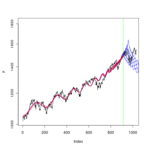
I suggested to my group that we study the LPPL model and its claim to predict market crashes. They agreed and we chose this as our project. My idea was to figure out how an investor might benefit from knowing about an LPPL prediction. And to make it as simple to use as possible, so that even my parents could benefit from it. No complex equations, nothing hard. The outcome was a GIF animation created from thousands of snapshots of the DJIA. A vertical line progressed along the DJIA chart from 1893 to 2012. The screen flashed red when the code determined that an investor should exit the market because the LPPL oscillation “signal” was strong – a critical point predicting possible market crash.
That was the end of the semester and while my classmates did their summer internships, I became fascinated by the power of LPPL oscillations to really predict market crashes. To me these patterns were something bigger than just a financial predictor. They were not just occurring in financial markets but in perhaps all complex systems. Since they were first discussed in earthquake physics, I really felt that by studying these oscillations I could learn about many subjects and perhaps discover something new.
Also that summer I started reading Robert Prechter's books on
Elliott Waves. How it took me so long to discover his books and ideas is surprising, especially considering I was in a Mathematical Finance program. This opened up my mind to more ideas about patterns occurring in financial markets and nature. Mankind is an emotional and social animal, despite our mass domestication and desire to lift ourselves above our human instincts. Combining Prechter's books with E. O. Wilson's sociobiology, you can see how I began to think of the collective human species as an emergent social organism. And this organism was somehow expressing certain properties of itself in the prices of market indices.
By the end of the summer I had developed an index which would monitor the power of any LPPL oscillations in real time. I was not aware of
Sornette's own Alarm Index at the time, so when I found out he created a similar tool it was great news and gave me some competition. After the initial index idea, I realized it had some problems. The fundamental problem I encountered was how to determine how many days of data to include in the formula: 1 year? 3 years? 7 years? My solution was to do a set of several different lengths and compare the results to see which did the best job at predicting the major market crashes. I was encouraged by one person who found my website when it first started. He helped me figure out more about how to develop the algorithm and the website.
The original model was developed in R (programming language ) and is not complicated. It involves fitting the LPPL oscillation equation to the time series to find its coefficients; then finding how well the (H,Q) derivative of the LPPL fits a desired frequency by analyzing its spectral density (periodogram). The index does this for each day and outputs a value. This is done on a rolling basis for all possible days for which I have data.
To determine the best number of days to use in the equation was an experiment with trial and error. There were certain values, for example around 1,700 days of data, which predicted some crashes well. At the same time, it failed to predict other crashes. And those other events were actually being predicted by using a longer length of data. Something odd was occurring and it took me a long time to figure out what was happening. The more I played around with this the more I started to realize that this index is perhaps suggesting that each crash has a characteristic build-up length in time. In other words, a fractal behavior, where crashes of
ANY size were occurring on
ALL time scales – a scale-invariant system. And this was what
Mandelbrot and Prechter had suggested in their writings on the financial markets. That reaffirmed my ideas and I continued to improve the index. I knew at this point that the only really true way to predict all crashes was to create indices for all data time lengths. In other words, a
contour graph was needed.
OV: What future features / developments can we expect from your website in the future?
TT: The site will eventually contain a contour for all trade-able assets in the world. This will take some time, since I only have four computers. Also, I hope to further improve the algorithm. The algorithm currently uses a default set of parameters of the LPPL equation. However, different assets tend to have different parameters. Changes in the algorithm are important, however, they are a small part of the idea behind The Bubble Index. I like to think that I have helped to develop a structure and outlet for systemic risk monitoring which will improve the underlying economic structure of the human species.
OV: Anything else you would like to add in conclusion?
TT: One of the recent economic depressions in history occurred at a time in which we had the internet, computers, satellites, and some incredibly smart people. So why can't we solve a problem which has been around since the dawn of human civilization? How do we still have economic crashes and depressions? People suffer and starve as a result of economic disasters; sometimes entire societies can be destroyed. There are many issues and problems to solve and to me the greatest unsolved problem of capitalism is economic crashes. I hope that The Bubble Index helps to solve this problem.
One thing I would like readers to ponder: just try to visualize the immense amount of time the Earth has existed. And try to comprehend how small an instant in time the human species has existed. Now try to realize that financial crisis of 2008, the Internet Bubble, the Great Depression, and all other bubbles and crashes before those. The Bubble Index could have been created for all time lengths going back to the dawn of civilization. And we could see how bubbles have been forming and bursting for millennia. These are natural phenomena occurring in a biological social organism on the face of the planet Earth. These are fractal patterns at work. All time scales are equally important. There is no random walk - there is nothing random about the growth of far-from-equilibrium living creatures inhabiting Earth.