Visualizing Recent Volatility Spike
I took inspiration from recent VIX and more post to create a different visualization of recent volatility spike. This is a dot chart that demonstrates volatility changes in the past month. Size and color of the dots corresponds to volatility (bigger and redder = high vol, smaller and greener = low vol), or you can hover over for numerical values. The left-most column corresponds to the VIX index, which is the most volatile, and underwent the most drastic change from high to low. Other columns correspond to futures, and are more stable, especially backs months. The chart was created using graphael library. If you don't see the chart, please try a different browser.
Subscribe to:
Post Comments (Atom)
Weekly market report
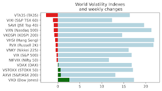
Wall st delivered a mixed bag of news with VIX, VNKY, and VSTOXX and their underlying markets almost unchanged. VXD - volatility index based...
-
John “Hojun” Hwang is the author of VIX, VIX Futures, and VIX ETNs, a conceptual guide to trading the VIX index. He graduated with degrees i...
-
As I am sure all of you know Russia has began a full scale war against my home country Ukraine. Please make no mistake - Putin's goal ...
-
 Wall st delivered a mixed bag of news with VIX, VNKY, and VSTOXX and their underlying markets almost unchanged. VXD - volatility index based...

No comments:
Post a Comment